Accordion
Block components used to create an Accordion using Bootstrap' collapse plugin.
Pellentesque habitant morbi tristique senectus et netus et malesuada fames ac turpis egestas. Vestibulum tortor quam, feugiat vitae, ultricies eget, tempor sit amet, ante. Donec eu libero sit amet quam egestas semper. Aenean ultricies mi vitae est. Mauris placerat eleifend leo. Quisque sit amet est et sapien ullamcorper pharetra. Vestibulum erat wisi, condimentum sed, commodo vitae, ornare sit amet, wisi. Aenean fermentum, elit eget tincidunt condimentum, eros ipsum rutrum orci, sagittis tempus lacus enim ac dui.
Donec non enim in turpis pulvinar facilisis. Ut felis. Praesent dapibus, neque id cursus faucibus, tortor neque egestas augue, eu vulputate magna eros eu erat. Aliquam erat volutpat. Nam dui mi, tincidunt quis, accumsan porttitor, facilisis luctus, metus
Avatar
Classes to format your user images. You can combine avatar classes with padding utility class to give to the image a nice white border.
.avatar-xxl p-2.avatar-xxl.avatar-xl.avatar-lg.avatar.avatar-smBootstrap Select
Classes to format your user images. You can combine avatar classes with padding utility class to give to the image a nice white border.
Light-themed Bootstrap Select
select.selectpicker(data-style="btn-selectpicker")
Primary Bootstrap Select
select.selectpicker(data-style="btn-primary")
Secondary Bootstrap Select
select.selectpicker(data-style="btn-secondary")
Muted Bootstrap Select
select.selectpicker(data-style="btn-muted")
Gallery with lightbox
A simple gallery using the Magnific Popup plugin as the lightbox.
Magnific Popup is a responsive lightbox & dialog script with focus on performance and providing best experience for user with any device.
Icons - Directory
This theme also comes with a 150+ Premium SVG icons. Icons included cover mostly e-commerce, restaurant and travel niches.
For a complete icon reference, see here.
Icons - Font Awesome
Vector icons and social logos on your website with Font Awesome, the web’s most popular icon set and toolkit.
These icons are mostly used in buttons or for social network links. For a complete icon reference, see here.
Maps
Maps inside this theme use Leaflet and tiles from Wikimedia Maps.
Big advantage compared to Google Maps is that these maps are free to use. For the map tiles, you can also use maps from Mapbox or OpenStreet maps.
Maps with multiple points
Maps that are used in the category listings show multiple points/markers. Also, popup windows are automatically attached to these points. To display this type of map, you need to provide your list of points in a GeoJSON file. These files will contain location data together with accompanying data like title, description, image path, etc. See below the links to the particular GeoJSON files used in this theme.
Map with multiple points - venues


GeoJSON file used to generate this map: restaurants-geojson.json
// Create an example category map
createListingsMap({
    mapId: 'categoryMap',
    markerPath: 'img/marker.svg',
    markerPathHighlight: 'img/marker-hover.svg',
    jsonFile: 'js/restaurants-geojson.json',
    imgBasePath: 'img/photo/'
});
Map with multiple points - rentals


GeoJSON file used to generate this map: rooms-geojson.json
// Create an example category map for rentals - text labels with price, different popup style
createListingsMap({
    mapId: 'categoryMap2',
    markerPath: 'img/marker.svg',
    markerPathHighlight: 'img/marker-hover.svg',
    jsonFile: 'js/rooms-geojson.json',
    mapPopupType: 'rental',
    useTextIcon: true,
    imgBasePath: 'img/photo/'
});
Maps with a single marker
Maps used on the detail pages do not contain popups and do not use a GeoJSON file. You pass all the data to the JavaScript function.
Single-marker map
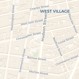
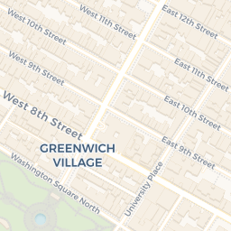

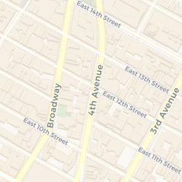

// Create an example detail map for venue
createDetailMap({
    mapId: 'detailMap',
    mapCenter: [40.732346, -74.0014247],
    markerShow: true,
    markerPosition: [40.732346, -74.0014247],
    markerPath: 'img/marker.svg',
})
Single-marker map, circle instead of the marker
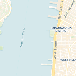
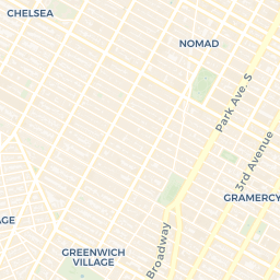
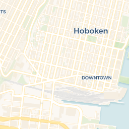
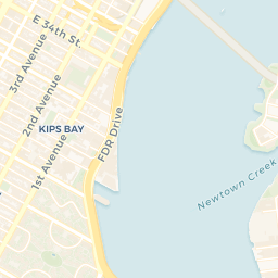
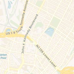
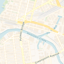

// Create an example detail map for rentals - show circle instead of the marker
createDetailMap({
    mapId: 'detailMap2',
    mapZoom: 14,
    mapCenter: [40.732346, -74.0014247],
    circleShow: true,
    circlePosition: [40.732346, -74.0014247]
})
Ribbon
Ribbons can be used in the venue component, venue carousels but also separately. Its parent needs a position: relative; and you can use theme colours for ribbon backgrounds.
Swiper
Touch enabled jQuery plugin that lets you create a beautiful responsive carousel sliders.
Used for the single-item carousels and also for the card carousels. You can initialize the plugin in JavaScript or you can also .swiper-init on your carousel and pass the configuration array in stringified JSON in the data-swiper attribute as in the example below.
Initialize the slider via .swiper-init and data-swiper attribute.
<!-- Slider main container-->
<div class="swiper-container swiper-container-mx-negative swiper-init" data-swiper='{"slidesPerView":3,"spaceBetween":20,"loop":true,"roundLengths":true,"breakpoints":{"991":{"slidesPerView":2},"565":{"slidesPerView":1}},"pagination":{"el":".swiper-pagination","clickable":true,"dynamicBullets":true}}'>
    <!-- Additional required wrapper-->
    <div class="swiper-wrapper pb-5">
        <!-- Slides-->
        <div class="swiper-slide h-auto px-2">
            Slide ...
        </div>
        <div class="swiper-slide h-auto px-2">
            Slide ...
        </div>
        <div class="swiper-slide h-auto px-2">
            Slide ...
        </div>
    </div>
    <!-- If we need pagination-->
    <div class="swiper-pagination"></div>
</div>
Or use JavaScript
var itemsSlider = new Swiper('.items-slider', {
    slidesPerView: 4,
    spaceBetween: 20,
    loop: true,
    roundLengths: true,
    breakpoints: {
        1200: {
            slidesPerView: 3
        },
        991: {
            slidesPerView: 2
        },
        565: {
            slidesPerView: 1
        }
    },

    // If we need pagination
    pagination: {
        el: '.swiper-pagination',
        clickable: true,
        dynamicBullets: true
    },
});
Background image
Utility class that turns a <img class="bg-image"> into a background image for its background. Useful e.g. for carousels. Make sure that image's parent container and the content that should be placed over the image are relatively positioned.

I have a background image
Image overlay
Utility class that darkens or lightens the backround image of the element to enhance the legibility. It can be used with cards, carousel slides, etc.
Gradient overlay adds vertical gradient that's darkest on the bottom third of the element.
Class reference
.dark-overlay, .light-overlay, .gradient-overlay - CSS class to be used on the element
.overlay-content - use this class on the element's content to increase its Z-index and move it above the overlay layer
Responsive borders
Responsive borders as an addition to Bootstrap's border utilities.
Class reference
.border-sm, .border-md, etc.
Block utilities
Additional utility classes, for block elements mostly.
Class reference
.bg-gray-100 to .bg-gray-900 - grayscale backgrounds
.bg-primary-light, .bg-secondary-light - lighter backgrounds for the theme colours
.opacity-1 to .opacity-9 - opacity helper
.hover-scale - scale element on hover
.hover-animate - move element up by few pixels on hover
.hover-scale-bg-image - scale element's background picture on hover
Text utilities
Text utility classes to control text size and more.
Class reference
.text-gray-100 to .text-gray-900 - grayscale text colours
.text-sm, .text-lg, .text-xl - text sizes
.letter-spacing-1 to .letter-spacing-5 - letter spacing 0.1em to 0.5em
.z-index-1 to .z-index-5 - z-index from 10 to 50
.text-hover-primary, etc. - text colour on hover/focus for theme colours
.overflow-visible and .overflow-hidden - overflow control
